Atychiphobia- the fear of failure
Tuesday, December 18, 2012
Monday, December 17, 2012
David Meanix
As creepy as the pictures are, I like these images because the of the masks. It evokes the feeling of hiding something and the disguise slowly disappearing. I especially like the wedding photo because it shows a truth that sometimes who we marry isn't who they appear to be. Overall I like his work because of how different it is from traditional art and photography.
Top 5 Fears:
1. Dodgeball
2. Failure
3. Escalators
4. Drunk Rabbit Puppets (it's complicated...)
5. Stone Statues (Don't Blink!)
Saturday, December 15, 2012
Thursday, December 13, 2012
Saturday, December 8, 2012
Untooning
For this project I decided to turn my brother into the brave Dudley Do-Right of the Mounties, who just can't do right. To do this, I erased everything except his head and then layered the uniform around it. Then I found a picture of a hat and used the Color Balance to make it red. I used this same tool for his hair. For the giant nose and chin I used the lasso tool to select the area, then under Transform I clicked "Warp" which allowed me to strectch and enlarge it.
Tuesday, December 4, 2012
Thursday, November 29, 2012
Friday, November 23, 2012
Homework: 10 Thankful Photos
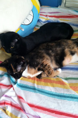
1. My kittens Boris and Natasha

2. Harry Potter
3. Art4. Piano (and music in general)
5. The Beatles
6. My little brother Noah
7. My other brother Walter
8. Pumpkin Pie
9. My dog Annie
10. My mom (and my dad too, but he hates having his picture taken)
Old Meets New
The top is a photo of my mother as a little girl (but I highly doubt she actually had an iPad!) The bottom is a painting I did last year called "Jedi Knights"
Wednesday, November 14, 2012
Tuesday, November 13, 2012
Magazine Comparison
Magazine covers have changed over the years. In this first one, it is obviously hand-drawn with carefully written letters. The colors are simple because of printing costs in those days. However in the second one, the patterns are more complicated and the realistic photo is contrasted with abstract designs. The bright colors are meant to grab your attention to the cover.
1926
2012
Monday, November 12, 2012
Friday, November 9, 2012
Thursday, November 8, 2012
Monday, October 29, 2012
Lichtenstein
Ben-day dots are a process where you take two or more different colored tiny dots to make a new color.
Roy Lichtenstein was a pop artist just like Andy Warhol but he had a very different style. Warhol used more rough, jagged edges with his contrast so that the photos he used looked much more like prints than actual photos. Also, his subjects looked more realistic even though he used bright, unnatural colors. Lichtenstein uses bright colors and bright contrast, but his subjects look more cartoony, almost like they belong in a comic book, and his edges are sharp and precise.
Here is my version of Lichtenstein-inspired, ben-day dots technique with Photoshop (which, by the way, is REALLY HARD to do):
Subscribe to:
Comments (Atom)


.JPG)


.jpg)


